As any New Yorker can attest, living in a central neighborhood close to work likely means having to rent a small apartment at a higher cost. But what if there was a way to have easy access to the center of Manhattan, while also paying lower rent in the process? To answer this question, we examined Zumper rent data from September 2017 across 13 NYC neighborhoods, and compared this dataset with commute times to high traffic work hubs. What we discovered is that by cleverly choosing where to live, any NYC renter can save without having to sacrifice too much time traveling to work and play.
Comparing rent savings and transit time
We selected 13 neighborhoods across Manhattan/Brooklyn and computed the median 1-bedroom rent in each of these areas. These were then compared to the median rent for all of New York City.
| 1 Bedroom | 2 Bedrooms | ||||||
|---|---|---|---|---|---|---|---|
| Pos. | City | Price | M/M % | Y/Y % | Price | M/M % | Y/Y % |
| 1 | Atlanta | $1,380 | 1.50% | 5.30% | $1,680 | -1.20% | 1.80% |
| 2 | Alpharetta | $1,240 | -5.30% | 0.00% | $1,500 | -1.30% | 7.90% |
| 3 | Dunwoody | $1,210 | 3.40% | 7.10% | $1,540 | 0.00% | 2.70% |
| 4 | Johns Creek | $1,200 | -1.60% | -0.80% | $1,460 | 0.00% | 0.70% |
| 5 | Sandy Springs | $1,180 | -4.80% | -5.60% | $1,530 | -5.00% | 9.30% |
| 6 | Smyrna | $1,090 | 4.80% | -5.20% | $1,320 | 0.00% | -2.90% |
| 7 | Roswell | $960 | 0.00% | -9.40% | $1,190 | 1.70% | -9.80% |
| 8 | Newnan | $910 | -4.20% | 4.60% | $950 | -4.00% | 0.00% |
| 9 | Marietta | $860 | -2.30% | 2.40% | $1,070 | -2.70% | 4.90% |
| 10 | Norcross | $800 | 0.00% | 0.00% | $1,010 | 1.00% | 12.20% |
| 11 | Gainesville | $780 | 0.00% | 14.70% | $970 | 5.40% | 9.00% |
Additionally, we chose one subway stop in each neighborhood from which to calculate average commute times to the 8 most popular commuter hubs: Wall Street, Grand Central, Times Square, Columbus Circle, Penn Station, Herald Square, Union Square, and Lexington Ave/59th Street. (Note that in same cases the average commute calculation included time walking.)
Finally, to identify the dollar amount for each hour spent in transit, we took the rent savings/cost and compared it to the average commute times to these hubs. The map below depicts our findings.
How much is your commute worth?
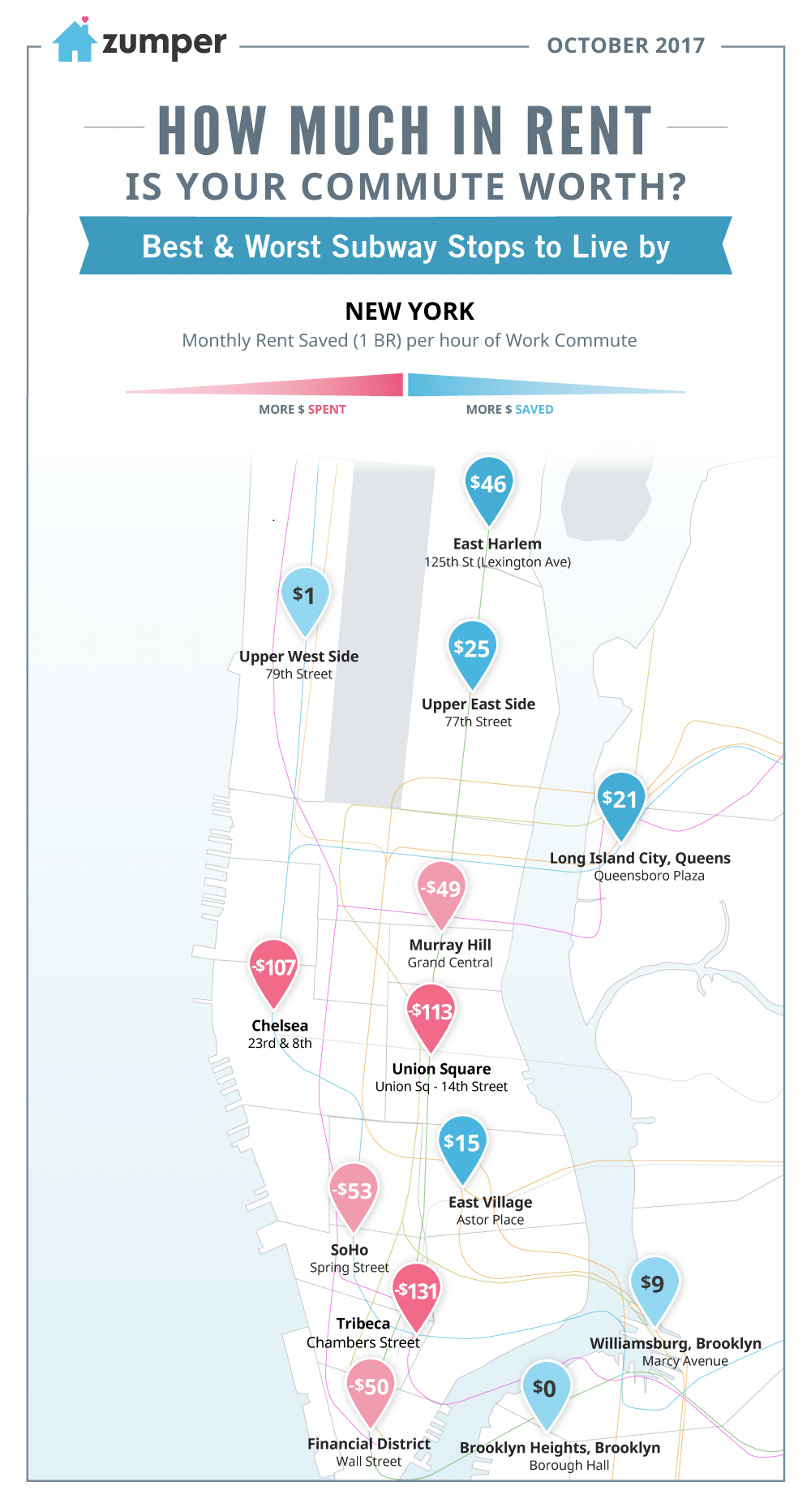
Blue shading on the map means one can save by living there, even when taking into account a longer commute time. On the other hand, red shading denotes that the area commands a rent premium.
As can be seen on the map, the most cost effective neighborhoods relative to commute time were East Harlem ($46 saved per hour of commute), the Upper East Side ($25 saved), and Long Island City ($21 saved). East Harlem, for instance, provides considerable rent savings when compared to the city wide median ($2,260 versus $3,000), while also having a decent average commute of 24 minutes. The least cost effective neighborhoods were Tribeca ($131 cost per hour in transit), Union Square ($113 cost), and Chelsea ($107 cost).
One major caveat is that these statistics only take into account median rent and transit time. There are myriad reasons why someone may pay a premium to live in a particular neighborhood. Secondly, everyone’s commute and preferences are different. Perhaps you live in Tribeca and are more than happy to pay a premium to walk to work. Overall, our map is meant to show that by cleverly choosing where to live, a renter can save while maintaining relatively easy access to the rest of the city.
Related content


